|
Trialling with tile
Right, these pieces are probably the product of a failure. I think that's why I kept them. I don't particularly like them - I know you're probably saying "it's your work! you should like it either way!" - well, I don't hate them. But I don't love them either. I'm just in the middle and I'll tell you why. So, one day I got excited to paint and keep practising the scrapping technique. Looked everywhere in the house for the protractor I was using at the time aaaaand nothing. Looked everywhere and got myself really annoyed as I couldn't find it. While I was looking everywhere, I found this little tile I had found at college. I don't know why I kept it or why I was even attracted to the tile but there you go, it gave me these 2 pieces. Don't get me wrong, I like the effect of the lines it left. To me it almost looks like prison bars and the painting behind it being locked away. I probably couldn't get the same effect using another material, but I think because I done it while annoyed - and quite disappointed I must add - it doesn't bring me the best memories. So why am I even babbling about this to you? You see, sometimes I even surprise myself about how a mistake can sometimes bring out good things if you just know where to look for it. The opportunities as they say. I feel like these works represent just that.
0 Comments
These 3 paintings were experiments using a protractor. I thought that by using a flat object which gave me a good grip to hold to, would help me have more control of movement. Turned out I was right. I loved the texture and the colour stain on the paper as the paint fixated to it.
By using Plutchik's wheel of emotions theory, one that I found throughout my research work, I could then name each peace according to his methods. Self-love - the green. Green is known to represent love for oneself. In the mix, I added blue and yellow. I believe that even the most confident person has moments of weakness and self doubt. Blue represents that. Sadness. Yellow, serenity. I use white in all of the paintings regardless of the colours I use. I just think white paint mixes well with any colour to give a feel of purity. Optimism - the orange. The colour orange represents the hope for the good yet to come. It has happy energy. Mixed with yellow meaning serenity and also red to mean anticipation and aggressiveness. To be fully optimistic I feel there needs to be a good level of patience. Talking from my own experience, in the process of mastering patience (can you really master it?) there are times when you feel anticipation, I'm pretty much a "I need to do something about it now" kind of person and most times it's out of my control so I have to wait. It makes me angry. And the process goes on like a circle. Remorse and contempt - the purple. So this one cause a bit of confusion. Most people that saw it said they could not see neither remorse or contempt through it. Purple on its own actually means boredom. However, when mixed with blue it means remorse and with red it means contempt. Can you link these 3 emotions to each other? 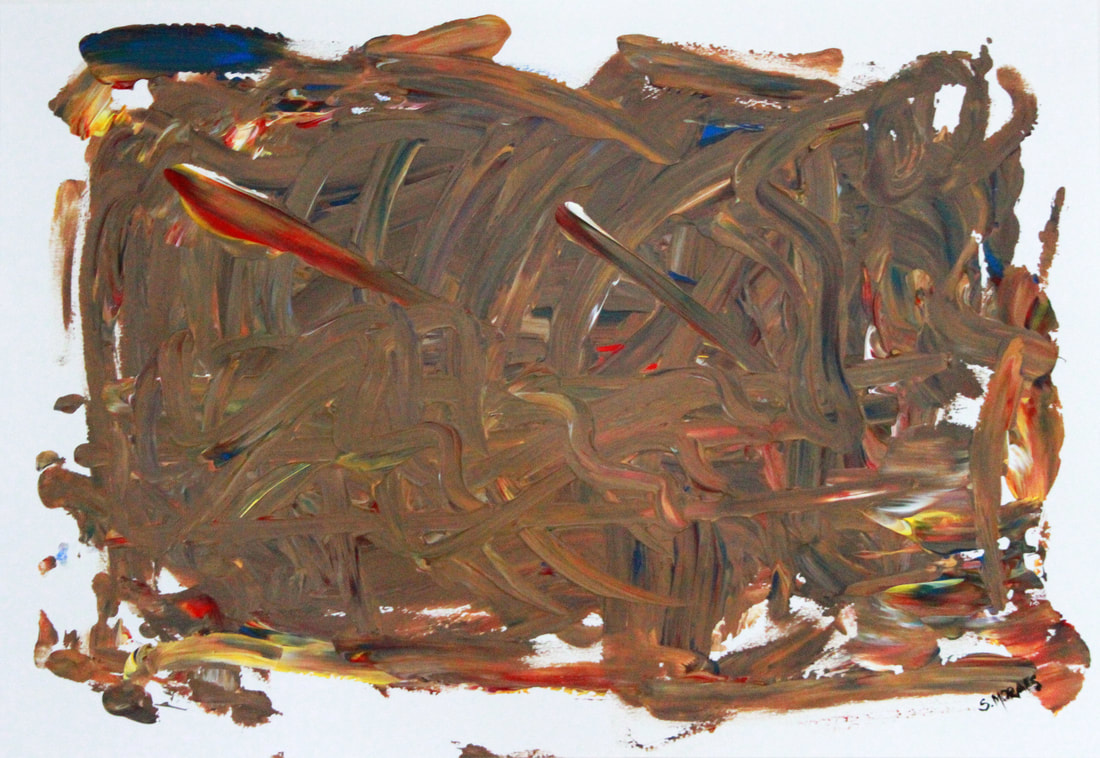 My ventures on unshaped abstract expressionism. As you can probably tell, I used my hands to paint this. It was much of an experiment of colours and technique.
I used acrylic on paper. The colours used were red, blue, yellow and white. All the other colours in between were achieved by the gliding movement of my hands through the paper. When I finished it, my first reaction was... eek! I had really disliked how all the vibrant colours had all turned into a nude colour but loved the few vibrant spots and after a few days I learned to like it. It's your creation after all. You always like it regardless of what it is! As I look at it, I feel mess, nonalignment, fluidity, optimism, sadness and hope. What do you feel? 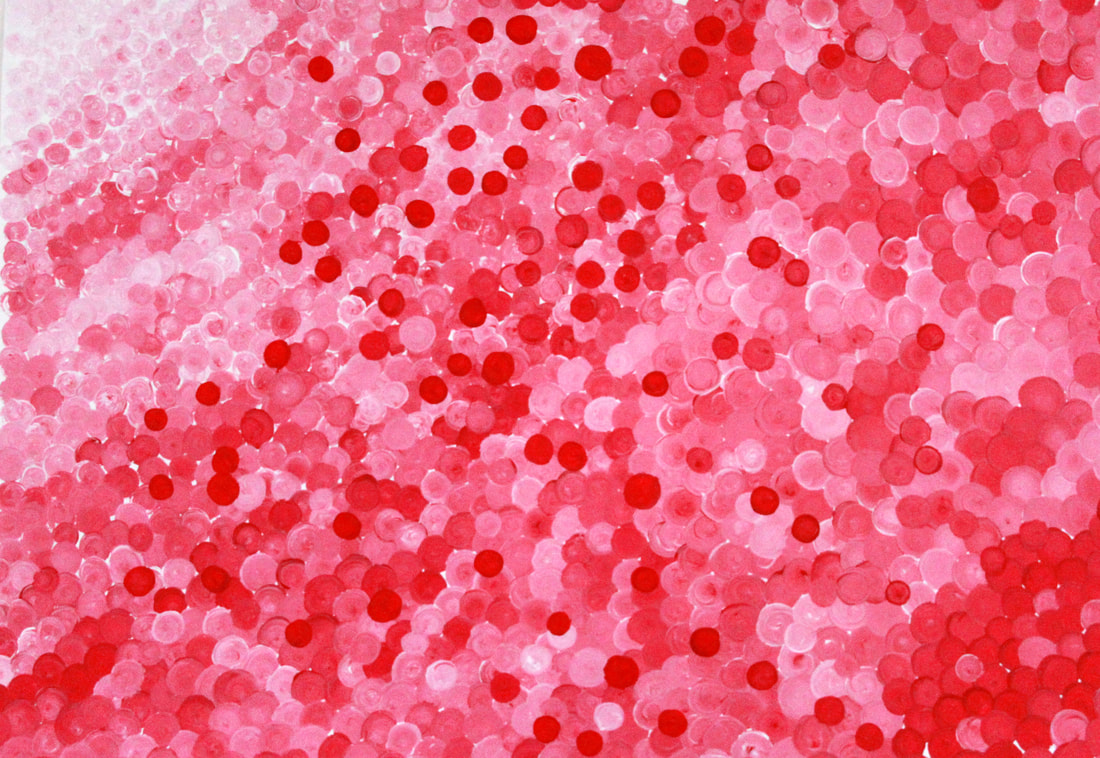 This was the beginning of the work. All started here. After much research and thought about the subject, one of the nights I watched an episode of Black Mirror where each person’s life were spheres locked up in a room and as each person died the sphere would be locked away and lit up. I took that in as a representation of us, humans. Our souls and memories all locked up forever in a box. I decided to play with shapes and colours to represent something. Taking the spheres as the shape, I decided on the colour pink, red and white as I really like those hues – they pass to me a sense of harmony, purity and stain.
From the top left hand side the colour starts from light (white) slightly stained with the red formed a very weak pink – much as the purity of when we are born. As years go by, our lives become more stained; we experience things, learn with them, hurt with them. As you reach the bottom right hand side of the painting, it comes to a much darker almost pure red with scattered pink (lighter shades of red) through. Growing older myself, I’ve come to notice that, at same stages of life (years), what I have lived already is not necessarily what another adult of the same age would have lived. People do have different views, experiences, thoughts and emotions to me. I even think that if I lived with my sister all my life without any difference in circumstances, we’d still feel different ways about the same things. The scattered red dots throughout the painting are stains of dear people or things we’ve lost throughout the years. I do like the fact that this piece has so much meaning behind it and I’m certain that different people would perhaps experience a different relationship with it. Technically speaking, however, I do think my brush strokes could have been more precise. Definitely the use of a better brush would have helped or perhaps another material? One of a circular shape already. Maybe a stamp! Not sure… I enjoyed the process of moving my hand round though, and the satisfaction it brought when I managed to get a perfect circle. Anyway... when the "only time will tell" project ended, I didn't want to stop exploring that study so I carried on with the same-but-different topic. I took her emotion of grief and started researching more around history and culture. How did the people deal with grief in the 20th century or even before? How do different cultures deal with loss? You know, questions that would broaden my understanding on the subject. Some of my findings were amazing. So I found that, the way we grief now-a-days (in England) was set up by the Queen Victoria when she tragically lost her dear husband - Prince Albert. She felt the loss so hardly that influenced a whole nation for centuries to come! It was also very interesting to learn about the Jewish, Islamic and Christian rituals. Having read that material, I could only come up with one synthetic opinion: REGARDLESS OF THE CULTURE YOU'RE PART OF, THE USE OF RITUALS IS WHAT HELPS A PERSON, FAMILY OR COMMUNITY TO HEAL They all had that in common, in all different ways of course, but done very efficiently. From that it made me think: "so, why do humans from different backgrounds -socially and culturally - feel the same things? And the answer I found (are you ready for some cheesy moment?) - was love. "IF WE DIDN'T LOVE IN THE FIRST PLACE, THERE WOULD BE NO SENSE OF LOSS WHEN WE PART COMPANY WITH THE PERSON OR THING WE HAVE LOST" So, from the use of an individual person I thought of the bigger picture of humanity. Instead of photography, I went into painting. I also enjoy painting but never explored it. So the past few months I've been studying colours, what can they show through them? how can I make you feel something when you see it? what do they represent? So, the images below is the process of development and exploration. |
Authorsu moraes Archives
June 2023
Categories |


 RSS Feed