|
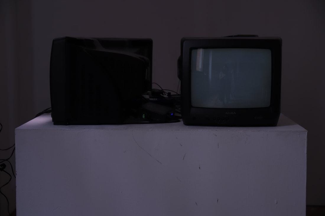
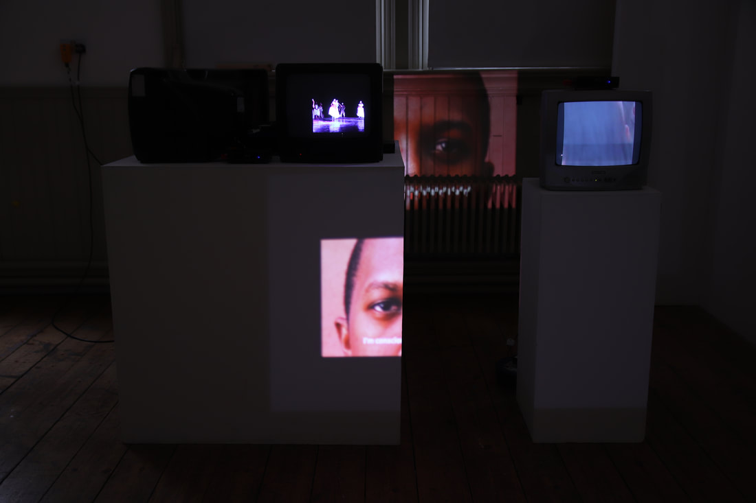
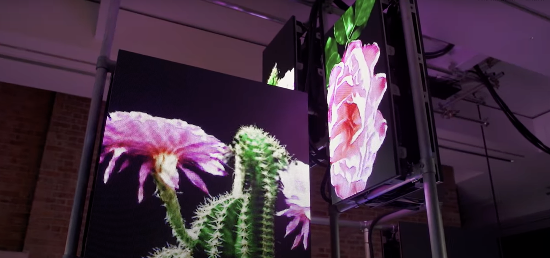
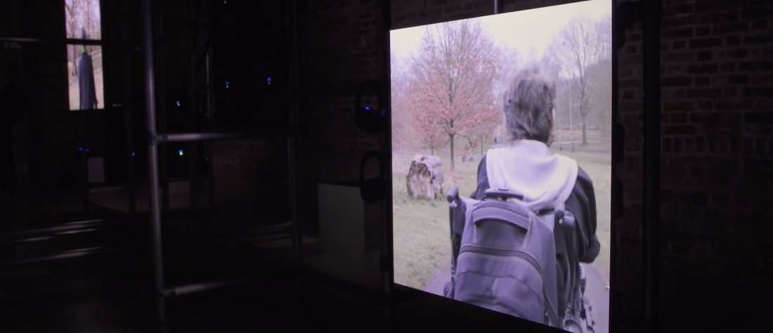
água, 00:00:34:00 loop, video installation 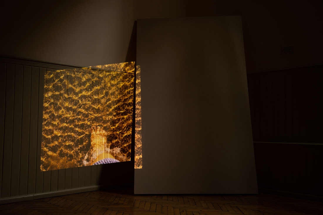 perfil, 00:03:16:14 loop, video 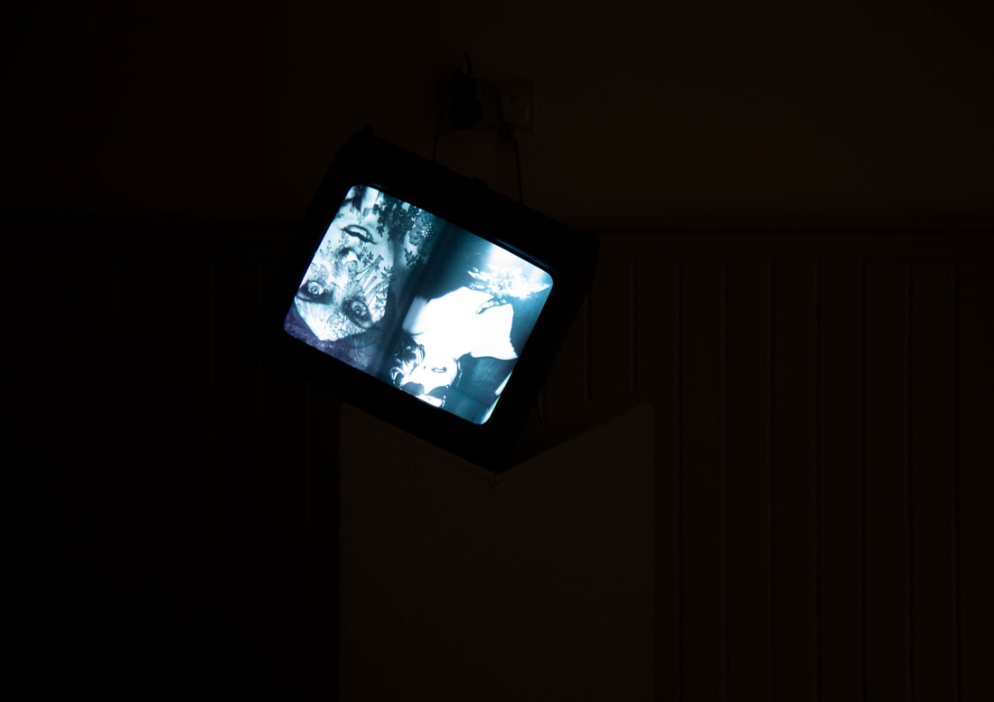 at what point do i become me?, 00:03:20:00 loop, video installation 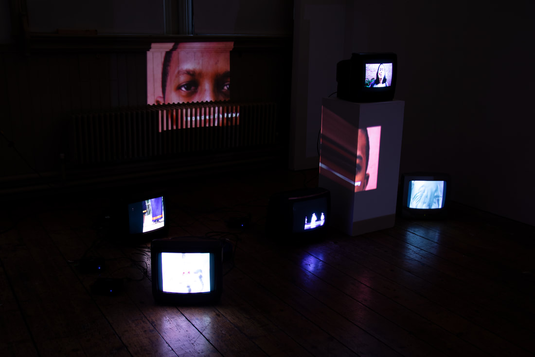 have i become me?, 00:02:09:00 loop, video installation 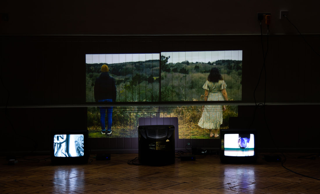 face-ecaf, 00:02:10:00 loop, video installation 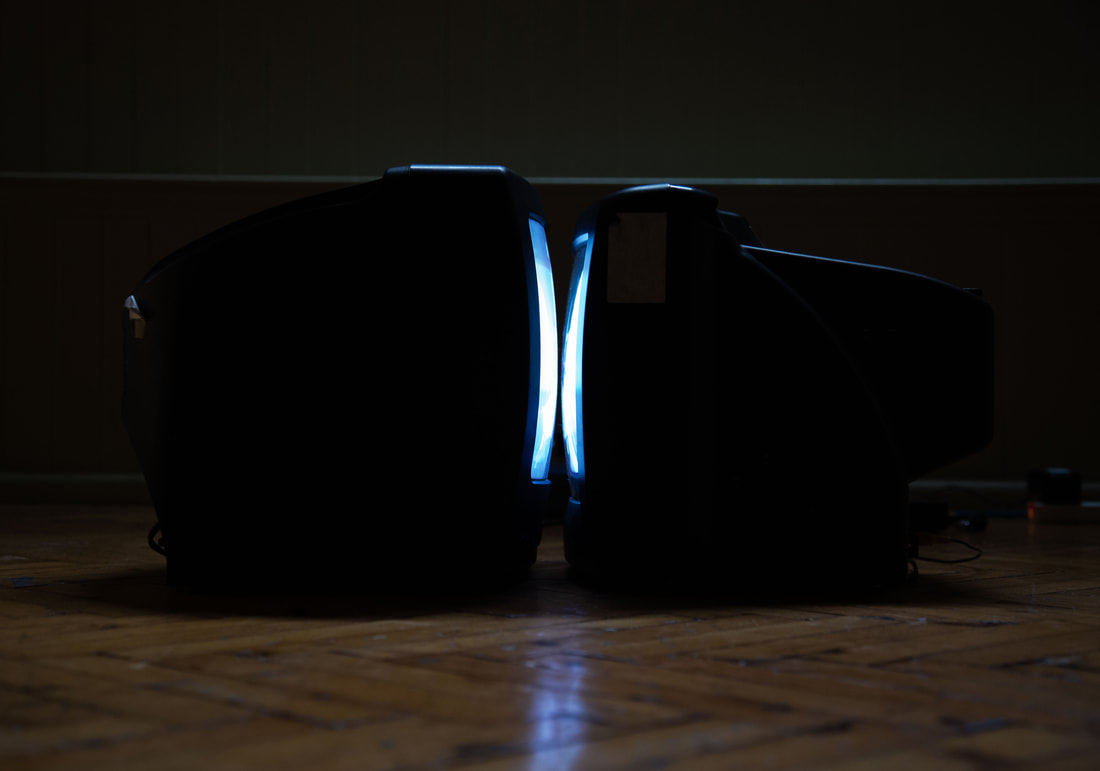
0 Comments
work no1 - tupi or not tupi, 2021 1st try
2nd try
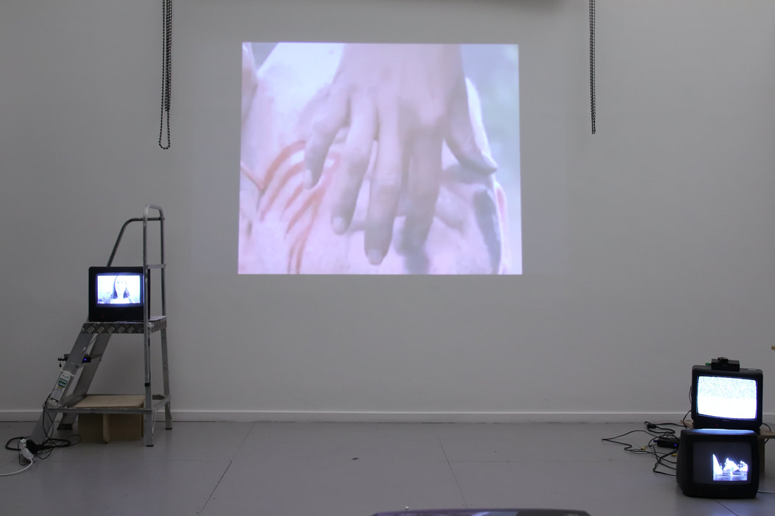
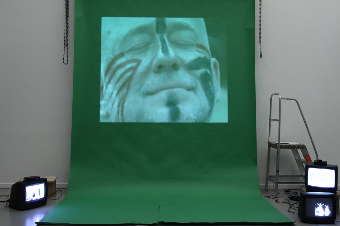
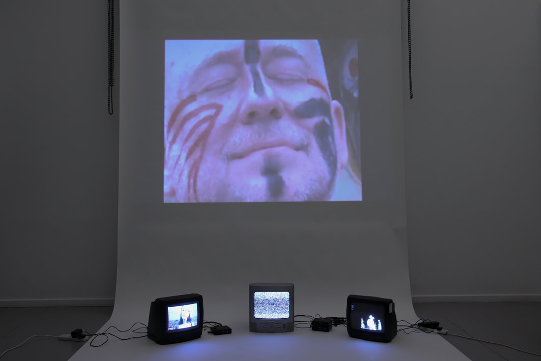
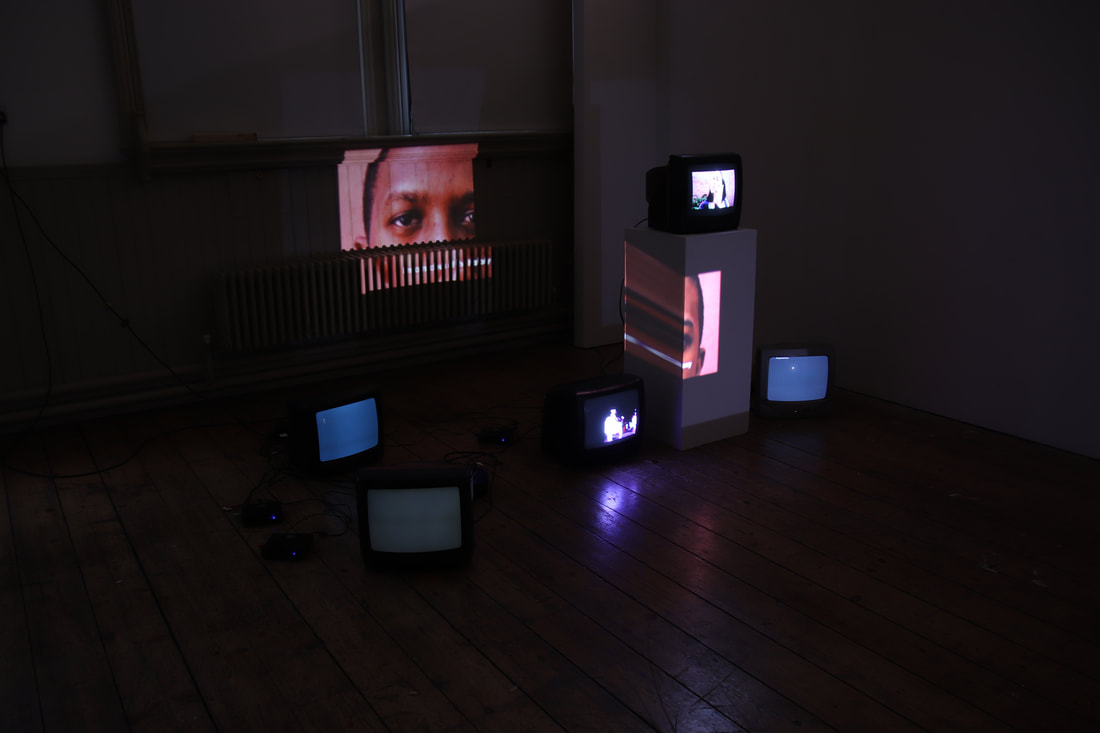 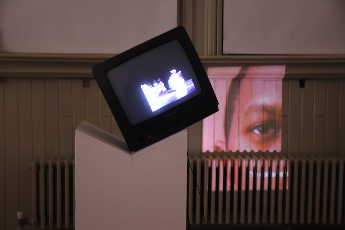   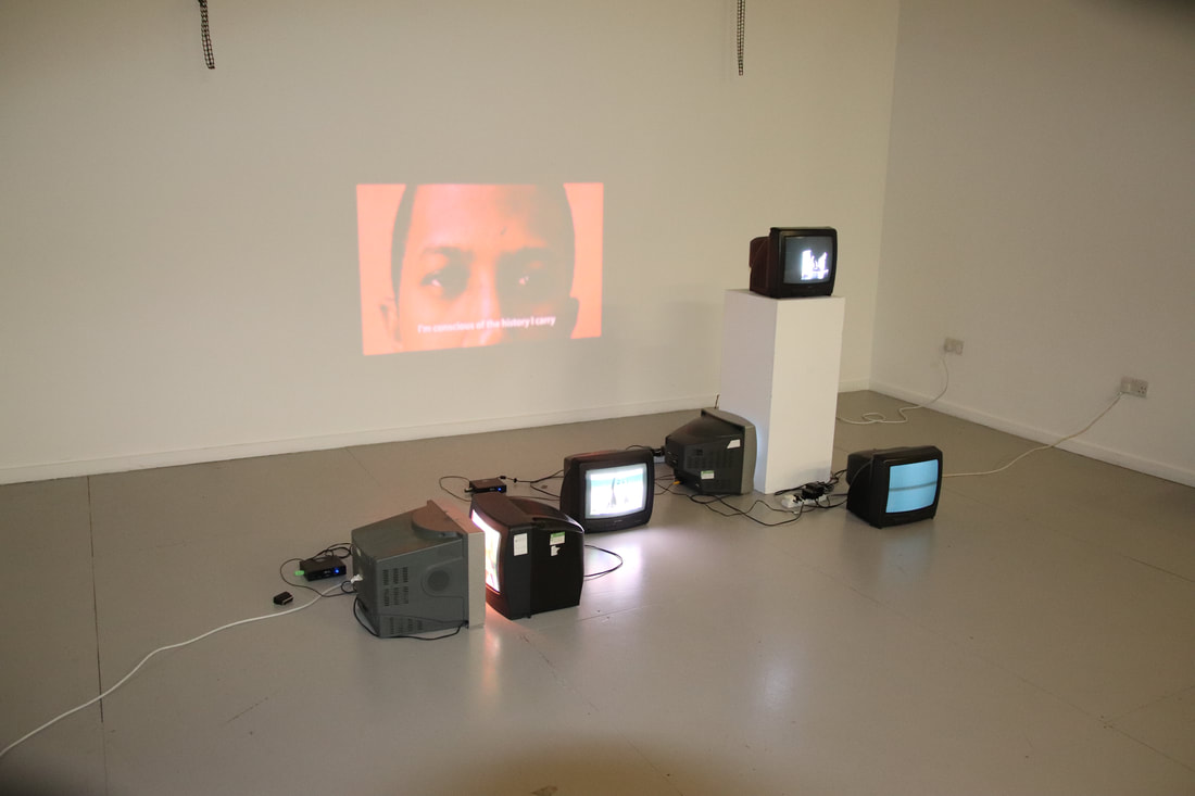 how the work is experienced in the space (no sound yet) performance piece experiment at the "end" of installation - inspired by anna maria maiolino in this installation experiment i used certain parts of my latest shooting endeavours such as the colour background and the portrait shot. i tried to see what it felt like in this way, with only three screens. somehow it seems to work better with three screens rather than six. perhaps the other three screens can become their own works, separate from this one. fifth experiment for display. this time i used the new footage i had been preparing and filming over the lockdown period. i love this approach and the quality of the film on the projection. film was captured using a cannon c100. work no 2 - água, 2021 looking at memory and displacement. how can you transport yourself to places through the mind? work no 3 - perfil, 2021 work no 4 - face-ecaf work no 5 - what they want us to know, 2021
risk assessment for exhibition 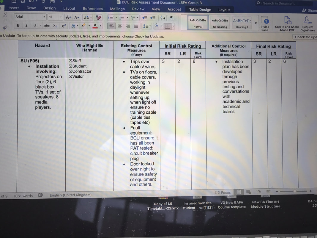 canvas making development of language 10/04/2021 today i had the idea to change the narrative of the video and create an intro part which makes it half film-half video art. i'm not sure how that is going to work but i feel compelled to use the in-between states just as much as i feel about my own identity - not quite here, neither there. 23/11/2020 the idea for the narrative came about in a trip i took to oxford. while in the bus, i had a strong urge to write. words just kept flowing into my head and i was able to construct a short narrative/creative essay. 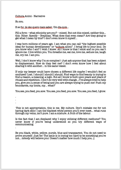 the narrative has a pendulum effect - it goes from one subject to another. at one point you have me, speaking in 1st person and then it shifts into culture speaking as the 1st person. there's an interchangeable dialogue between the two subjects - referring to the dialogues that are interchanged among different cultures converging. there's an attempt to make one understand the other for ease getting-along. since then, i have added more. i have not recorded the second half of it yet (where it starts: "this is not appropriation"), although it fits in with the theme and could easily be a continuation of it. i feel it could lead to a different work - separate from this film. what doesn't work in it?
other experiments making a skirt for the film. i plan to dance with it in a cultural style. inspired by the traditional chita fabric pattern from brasil. 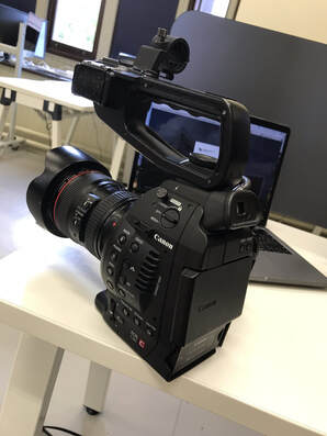 decided to have a go at using the cannon c100 camera. want to shoot high quality scenes with it. collaboration of sound 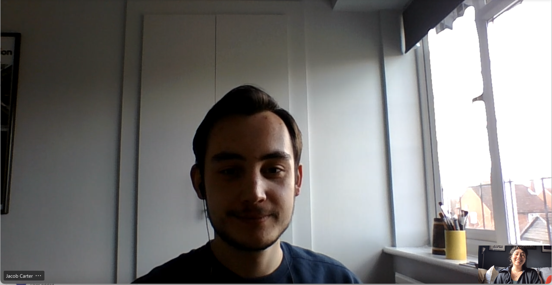 after editing and adding rhythm to my work, i decided that i could actually source rhythm from working in collaboration with other artist friends. jacob carter (pictured above), accepted the invitation and soon started working for a sound piece for the video. without shaker. with shaker. final audio with video towards the finalised work what is working?
what's not working?
to do:
splitting the film
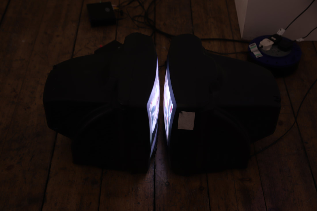
had the idea to split the film into different screens and display it as an installation. all the different screens show a piece of self - a display of memories that forms a person. third edit don't like that i come up twice in this version and the scene of the dancers is too long. what works.
second edit i found this footage which shows a white man being baptised by an indigenous tribe in brasil. i really feel i should continue to make work about my identity and my experiences with displacing. "tupi or not tupi" is a line from manifesto antropófago by oswald de andrade, whose work served as an inspiration for mine. first edit not sure where i'm going with this but, i've put together some interesting found footage that might turn out to be something in the future. further developments filming at licky hills. scene inspired by the ketchup face painting from the first film. ketchup symbolises 'readiness to be eaten' by another being/thing. also, it's a criticism to the act of adding ketchup to foreign food, in order to transform it into one's own taste by masking the originality of the dish. experiments with projection. i've always wanted to project colour onto surfaces and as i was experimenting with that, i noticed my shadow on the wall and decided to play with it. experiments with colour mixing through print. an inspiration from the projection experiments.
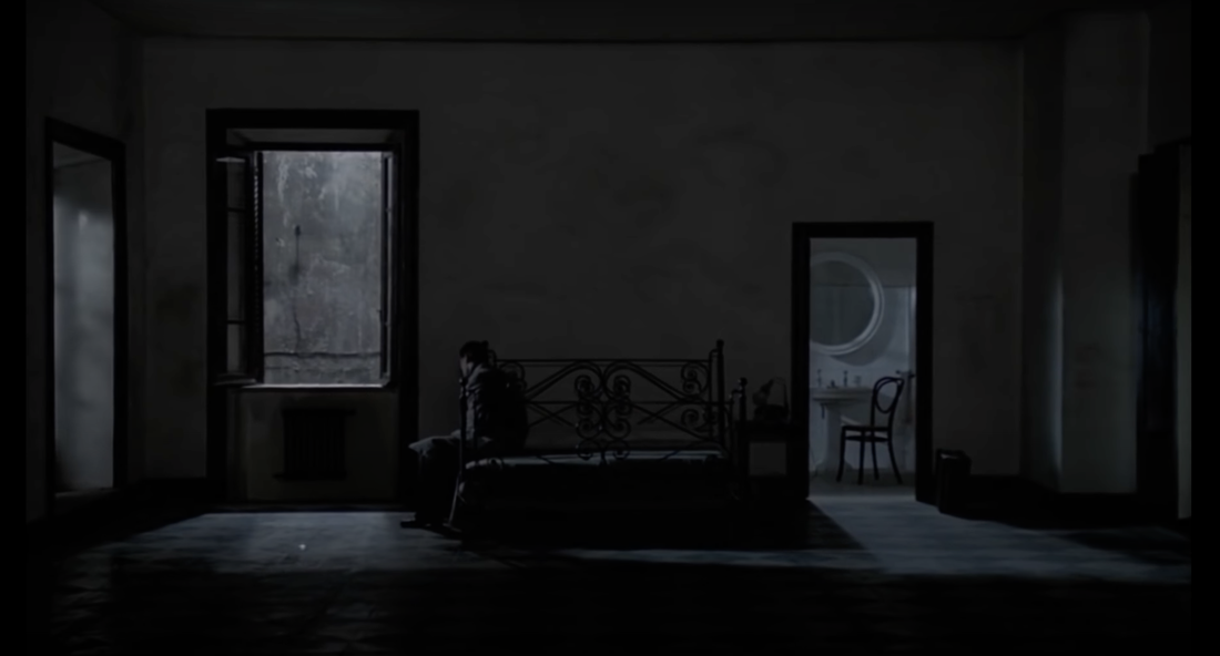
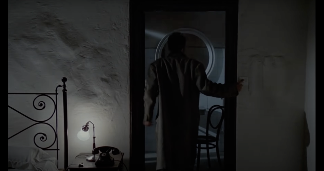
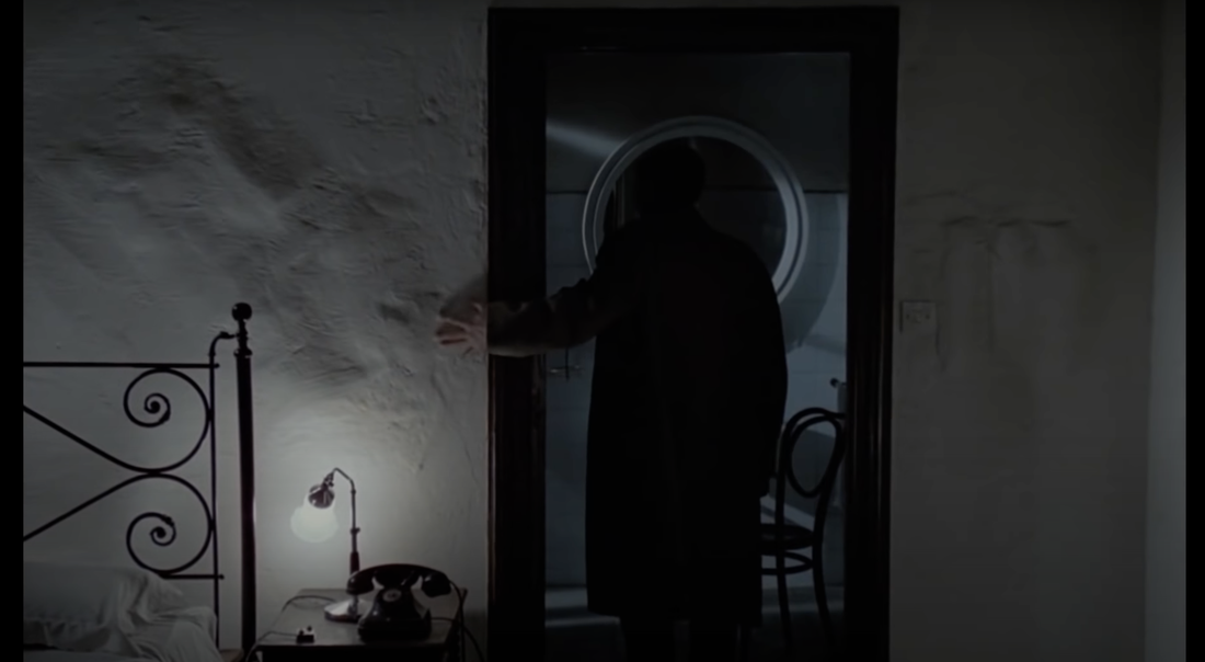
ciara philips - canadian artist. 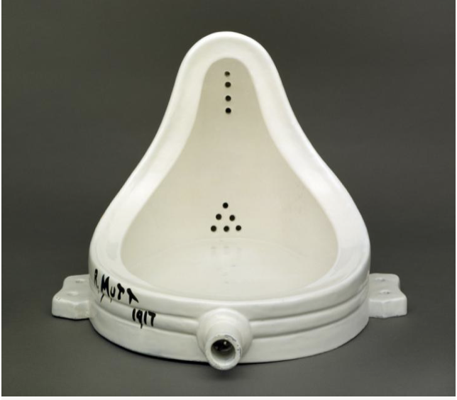 marcel duchamp - french artist. i've always been familiar with the fountain, but as i've been experimenting with my work, i remembered the flipping of the fountain and how dadaism allowed artists to make such choices and see how the meaning would shift, etc. my decision to flip the tv screen in perfil came from this work. 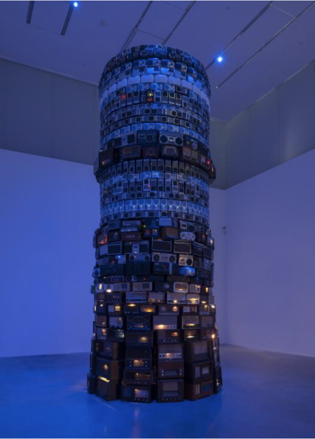 cildo meireles - brazilian sculptor and installation artist. babel overwhelms me every time i walk into the tate collection. it's big, noisy, much of what it feels like when you move places and try to adapt to a new language, lifestyle. 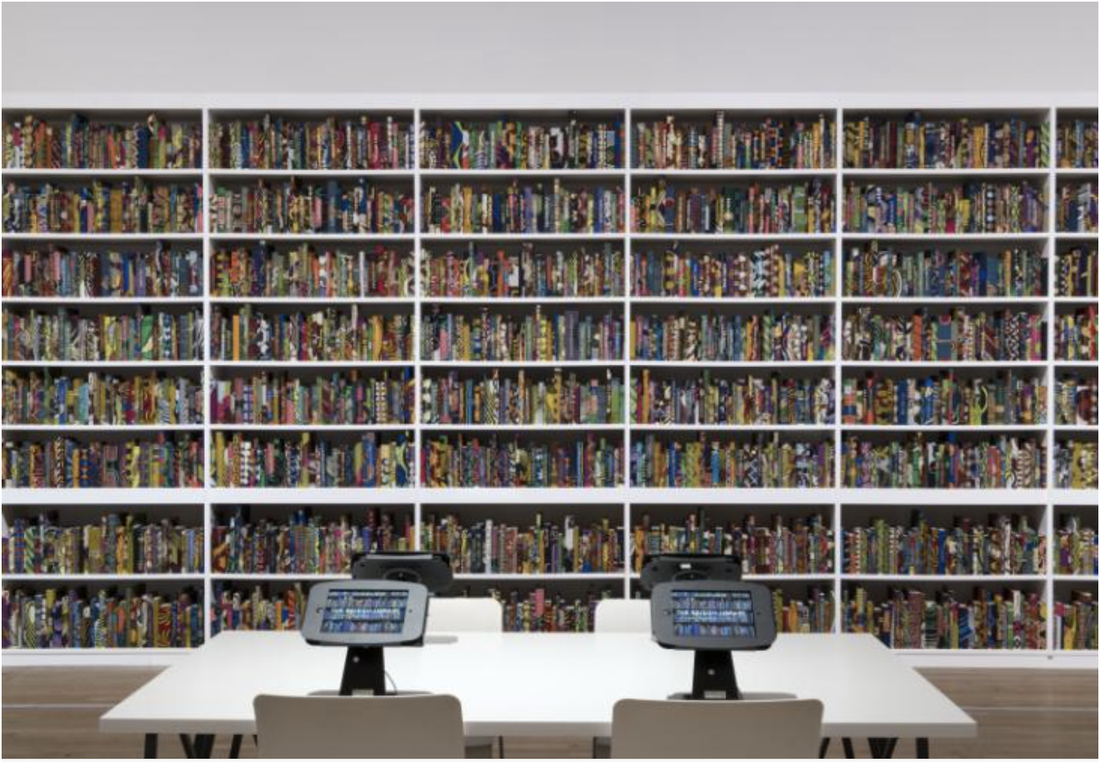 yinka shonibare - british artist. the british library is a celebration of migration through naming books with the names of migrants. it's so touching to see even through a photograph. 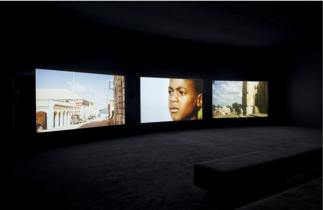 john akomfrah - british filmmaker. in his work the unfinished conversation, he talks about formation of identity whilst looking at the life of stuart hall. john often says that history is important to filmmaking - understanding the past is essential to thinking about and forming the future. 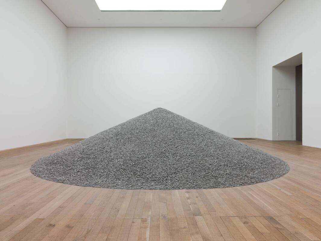 ai weiwei - chinese artist known for his works about identity, social change and celebration of culture. his sunflower seeds work is familiar to me but i realised how my use of a food item (ketchup) to metaphorically represent a process of cultural formation, is similar to his use of sunflower seeds. 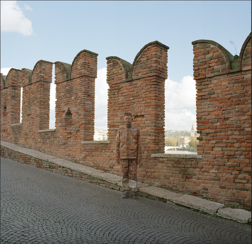 liu bolin - chinese artist known for his art of concealment. i was drawn to the idea of the in-betweeness of his work through camouflage. will explore this idea further with light and projections. 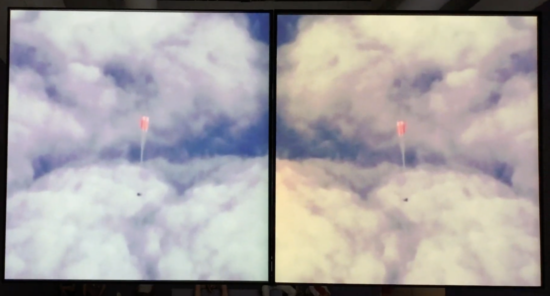 stan douglas (canadian filmmaker/installation artist) - i came across doppelgänger and was fascinated by the display of the film in two separate screens. they occasionally synchronise but for most of the film, it shows different perspectives of a scene or entire different scenes. even if it's the same scene being shown, they are differentiated by the use of colours. 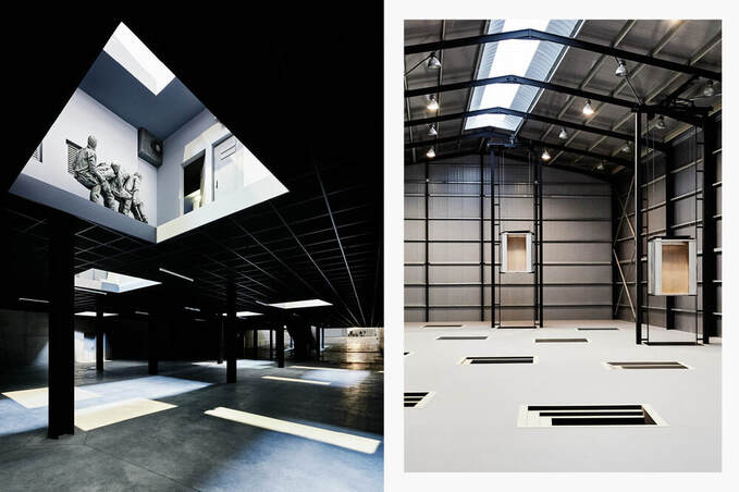 juan muñoz (catalán artist) - in his installation double bind, juan creates a sort of theatrical installation where he compartmentalises different 'scenes' in the physical space. each scene is meant to give the audience a different perspective and serves as an emphasis of the alienation of the audience. this in turn helped the audience to attach different meanings to the work, which provides enrichment to the same. i like this approach, and without knowing adopted the same for my work. hito steyerl (german filmmaker) - in this exhibition hito displayed her film in a series of different shapes screens with beautiful flower imagery. vibrant colours, zoomed in shots. just flowers and the representation they have with power and beauty. i particularly love the aesthetic that these screens together with the work portraits. andrei tarkovsky (russian filmmaker) - i came across andrei's work through john akomfrah. watching andrei's films is such a "breath of fresh air". these scenes in particular spoke to me as the character reaches for the light switch as you do when you are familiar to a space - not looking for it but intuitively reaching for the switch - only to find that this is not a familiar space and that he needs to get used to this new environment. he's "awakened" by not finding the switch instantly and has to look for it on the other side. this is an interesting scene which says so much about belonging, feeling safe and familiar with yourself, something or someone. 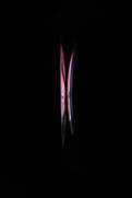 jonathan moss - dot to dash. https://vimeo.com/38093649 usually his work is not really relevant to mine in terms of themes and editing style, however, his dot to dash video captured my attention. it shows a sequence of 'bitty' moving images with a dot developing into a line which takes different forms as it moves. with one of the display trials, i came across some pictures which showed lines of light formed by the contrast between the light emitted from the screens and the dark room (picture to the right). i wasn't sure how to use this find for the development of the film but watching moss' video has inspired me to: - use the same idea of shapes within the video with dancing moves - utilise shadows and light to create shapes in a dark screen - use the idea of light starting small and growing as the story develops 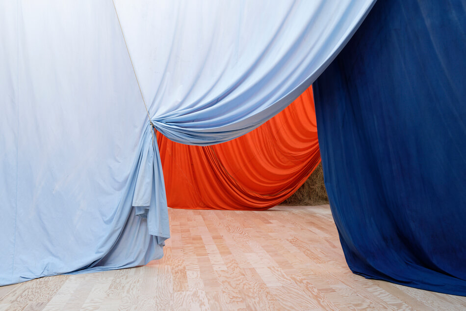 ulla von brandenburg's use of fabric to create 'new worlds' really fascinates me. In a more abstract way, fabrics can be used. she says: "the separation between the interior and the exterior, or between different worlds, becomes blurred. And that blur makes us wonder where we are." that links perfectly to my themes of displacement and cultural identity. The hybridisation of worlds. 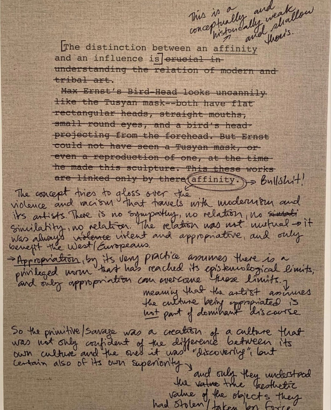 text by meleko mokgosi. i love the the way in which he writes with so much passion and conviction. the topic of appropriation also comes into my work. here, in a more historical context, i like when he says "and only they understood the true aesthetic value of the objects they had stolen/taken by force". relating this to brazilian colonialism, it's evident that we were not the only 'raped' colonised nation.  serena lee's work usually touches on language as a code and 'passport' to the world. in a slight different perspective, i like how this work makes me think about how language influences power and opportunities, not only in the everyday, but also in the art world. 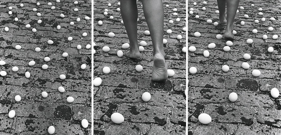 'entrevidas (between lives)' by anna maria maiolino.
i love how she uses eggs and blindness to cause awe and anxiety to the audience. in this work she talks about how being displaced and 'fitting in' makes you feel like you're constantly walking on egg shells. I tend to start my work with my experiences in the world or with a context. It is usually reflecting on something I've read, written, thought or seen. There are three pieces of work by three different artists that really resonate with me, for three different purposes: 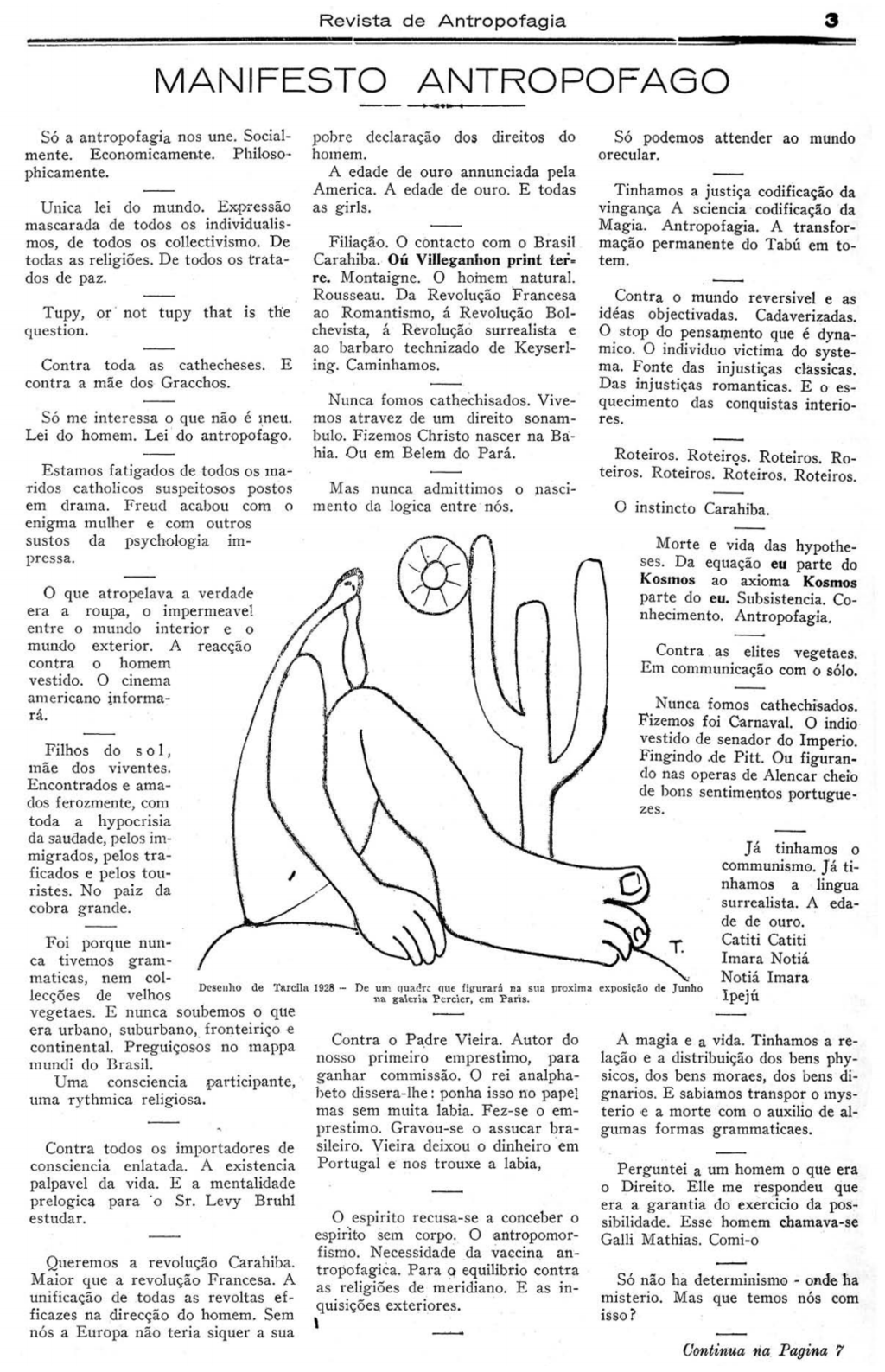 Anthropophagy Manifesto by Oswald de Andrade, is my contextual visual essay. Anthropophagy is the eating of human flesh, but in a less literal meaning of the word, Oswald used it philosophically to represent how we as humans (here he's talking specifically to Brazilians), have the tendency to copy others characteristics, and 'rob' or 'eat' those traits into our own selves, consequently resulting in less authenticity and under appreciation of one's own achievements. The manifesto was written as an attempt to 'liberate' the Brazilian creatives from the chains of European influence in their works - in other words - to find their own identity. Although my work talks about anthropophagy in the same philosophical nuance, I am taking it into the context of cultural displacement and how differences can coexist within one person. Who eats who? and what is the result in identity? 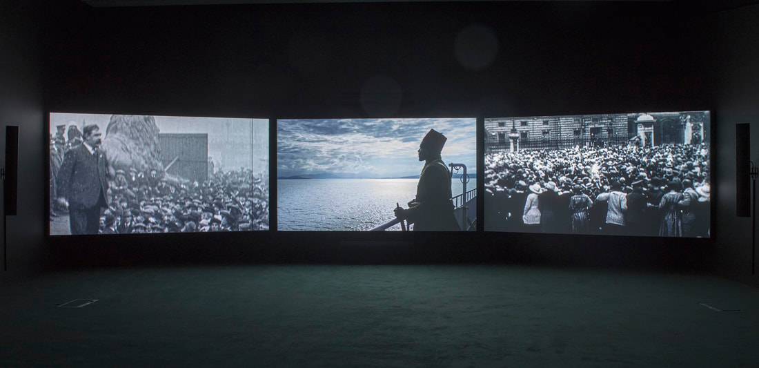 John Akomfrah's works are my displaying and practice visual essays. I love the way he displays his works - always big and using three screens. His films are always captivating and aesthetically beautiful even when touching on hard subjects such as memory, post-colonialism, temporality and aesthetics, and often explores the experiences of migrant diasporas globally. 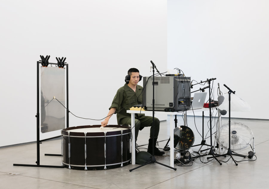 Samson Young's work inspires me by the process he uses to capture sound. He works with normal objects to mimic known sounds, such as, war and bird sounds. He recreates 'sound worlds' that captivate and engulf you. He is also very experimental in how he records sound, going outdoors, and using anything from nature to busy streets and people.
It is now the beginning of the journey. New academic year and the excitement of graduating and starting a career. This year I have got the motivation to not be mediocre and to push myself to be as productive as I can be. Making art during lockdown was a struggle and I realised that I do not own time; there are forces greater than I that rule above my life. My power is to choose what to do with the time I am given. Thinking that we have enough time and we are the creator of it is a lie. We are mere managers of it. With that epiphany, I started the year with a slight different approach. I am now more organised, more engaged, better able to be present and help in different projects, excited about 'losing control' of my thoughts and embrace the opportunities that come - either in life or in making. Since last year, I still feel a great desire and passion to discover and understand how moving from Brazil to England has affected me - how I see myself or how others see me; how I behave and think; how much of my struggles is a result of it; how can I find my identity in this mix. I know those feelings and thoughts are not exclusive to me and to those that have not experienced this, my way of showing different perspectives might help them understand immigrants better and result in more unity (hopefully). Compassion is something built on understanding and this is how I hope my work will correlate with the immigrant, colonised, the local and the coloniser. This 'notes' session of my website will serve as a log of the progress of my processes, my research and findings, my thoughts and ideas. As a commitment to self, to always remember to be free with my thoughts, making and ambition. 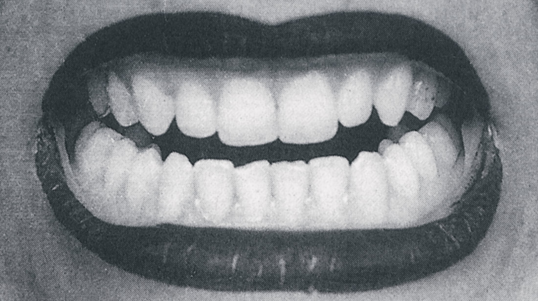 Anna Maria Maiolino, In-Out Antropofagia (In-Out Anthropophagy), 1973–74, Super-8 film transferred to DVD, black-and-white, sound, 8 minutes 14 seconds.
Open borders live project
Open adjective 1. allowing access, passage, or a view through an empty space; not closed or blocked. 2. exposed to the air or to view; not covered. Borders 1. a line separating two countries, administrative divisions, or other areas. 2. the edge or boundary of something, or the part near it. I was first drawn into this live project as I was presented the brief. The way it was ‘sold’ was to, think of land and ownership as the basis for political stance. I thought it would be a good live project to be involved because, although I do not have a great knowledge of political matters, I do have a great interest in how people are governed, how leaders and the way society is organised impact on the people within. That seems to always be the basis of my motivations for making work about. I never thought of myself for being an activist artist but making art for the sake of change either personally or in a larger scale, trying to bring an awareness of what it is like to be in someone else’s shoes so that we can better live amongst each other, is surely what I believe I make art for. Before starting a project, I like to dissect the words within the title so I can better understand what it is asking of me and which side of its meaning I feel naturally inclined to concentrate on. After doing that I decided that talking about Open Borders would be about land ownership and value. I am currently researching about Birmingham and found a lot of good research material at the Birmingham Museum and Art Gallery. One of the things that really caught my attention was the story of when the land that we now call Birmingham was first found. Peter de Bermingham arrived in the area and purchased the land for £1. For a while the land didn’t mount to nothing until Peter decided to open a market. He noticed that a lot of travellers coming and going from different parts of the lands would eventually cross through his territory. The market was a success which then attracted farmers, crafters and all manner of different makers and producers to the area. The market grew and grew, settled people were renting and selling land for profit and that’s how Birmingham became to be what we now know. I have been sharing my thoughts with my module tutor. We diverted the conversation to how water is important for a thriving society/town. Much of the success Birmingham has had is due to the many canal systems that were built in the 1700’s and 1800’s, facilitating the logistics between cities nearby or far away. My statement of intent states: “The main theme of my work is based upon the relationship between land and power, and how that has affected society since the 12th century when Peter De Bermingham purchased the land we now call Birmingham, hitherto. I have ideas to explore what it means to own land, and who we are serving when we labour on the land.” Insert pics of peter de bermingham and Birmingham in the early ages I watched “Robinson in London” and “Robinson in Space” by Patrick Keiller. I couldn’t get much into the swing of the films, perhaps the over-elaborated text makes me ‘zone out’ and I lose focus. I did, however, notice the way the movie was filmed. Still images, photograph-like, at some shots might as well have been photographs we wouldn’t know the difference. That intrigues me, it gives the films different perspective and combined with the text I got a sense of memory or photo-album storytelling, if such term exists. I couldn’t get hold of Robinson in Ruins unfortunately, there isn’t one in the library and it’s a very low-key film – can’t find it easily https://www.youtube.com/watch?v=Noa7i9qqq3c Research Derek Jarman You have 13 minutes to stand in the box and lose track of time. The number 13 was chosen as a metaphor for the commonly known number associated with being unlucky but also for being the artists favourite number. The idea is that, we all have these words playing in our heads and the weight and pressure of them cause us to feel anxiety, stress and defeat. To not feel that way we often avoid situations where those feelings are emerged. What if the way to solve was to be immersed in it? What if spending 1 minute in each word would make you more grateful for who you are now? Whatever words they are for you, I invite you to do so.
The next step was then to decide what colours to use. One thing I knew for sure: I wanted to work with acrylic. The reasons being are that most fine artists ignore acrylics (so I found) but not just that, as my project was about loss and grief, the dullness of the paint once dry really spoke to me. It was like life being sucked away. Also, let's be honest to ourselves, it's a super quick drying medium. Looking back at all the experiments and research I realised that there's really not a single thing that a person going through bereavement feels. It's something different everyday, varying throughout the same day. One day is anger, another hope. One day is happiness, another is a sense of hopelessness. And so on. I decided then to use multiple colours to portrait all these explosion of feelings one has. The emotions come like waves, taking over you, crashing against the rocks and sweeping you away. And that's what I went for. Each colour represents a different emotion. At different stages. And they break apart as the painting goes along in an attempt to insinuate fragments of time... Those pictures are in sequence of development. I found difficult to decide when enough was enough. When is it enough to show what I want to show? You always fear that you're going to end up putting too many layers and making it visually not as appealing. But why do I want it to be appealing? It has to be meaningful, thoughtful. Every line, every scratch, every mark. And that's when I'll know I've done enough. The final stage of the work encompasses all of that. Starting from the left hand side... 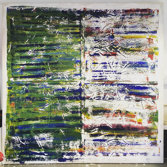 The green area. Green is known to be associated with self-esteem, rebirth, revitalisation. On the other hand, green can be associated with putrefaction and sickness. Linking all that connotation to grief, my thought behind was the clash between death and rebirth. It's like a monologue I watched called "The Birth of Death". At the end of the show the actress said "there's always birth after death" and that stuck with me. After something bad happens in your life - death, a break-up, sudden change - it's like a new you emerges. You're stronger - maybe not at the beginning - you're wiser, you're more aware, you're more alive. Maybe this is the plan all along. You know, the why we have to go through hardship. But anyway, that's the colour green. It moves along the canvas in a horizontal motion. From left to right. Kind of like a passage of time. Clockwise. When it reaches the middle of the canvas, it breaks into fragments. Shattered emotions breaking into the horizon. In that area you have a mixture of colours. There is red, blue, green, orange and yellow. - There are some shades of pink. Not intentionally, it's just how the paint met one another as I scrapped - just thought I'd be honest with you. The red. Blood (obviously) - there's not much to explain about it. You get it, right? The blue. So blue is associated with grief, directly. It's also commonly known to signify sadness. The orange. Optimism. The sense of "better things to come". A hope for better days. The yellow. Serenity. The state of being calm, untroubled. Now, that's a tricky feeling. One that is probably the most difficult to achieve. Behind the green area through the spaces, you can still see the layers behind. They are the same colours from the right hand side. Blue is scattered all throughout the canvas with the same meaning as mentioned before (also see the genealogical tree post). It is of course the main emotion. The main subject of the piece. It's only right that it'd be everywhere. The stripes As I mentioned in the priming post before, I left the priming quite thick to create stripes.
From the images you can see the effect it left. It's got texture and as the press the canvas with the paint onto it, the lines created border, breaking the colour, giving it an end and a continuation straight after. Additionally, they mean the cuts and scars of life. How we hurt but heal. Just give it time. |
Authorsu moraes Archives
June 2023
Categories |
 RSS Feed