|
The next step was then to decide what colours to use. One thing I knew for sure: I wanted to work with acrylic. The reasons being are that most fine artists ignore acrylics (so I found) but not just that, as my project was about loss and grief, the dullness of the paint once dry really spoke to me. It was like life being sucked away. Also, let's be honest to ourselves, it's a super quick drying medium. Looking back at all the experiments and research I realised that there's really not a single thing that a person going through bereavement feels. It's something different everyday, varying throughout the same day. One day is anger, another hope. One day is happiness, another is a sense of hopelessness. And so on. I decided then to use multiple colours to portrait all these explosion of feelings one has. The emotions come like waves, taking over you, crashing against the rocks and sweeping you away. And that's what I went for. Each colour represents a different emotion. At different stages. And they break apart as the painting goes along in an attempt to insinuate fragments of time... Those pictures are in sequence of development. I found difficult to decide when enough was enough. When is it enough to show what I want to show? You always fear that you're going to end up putting too many layers and making it visually not as appealing. But why do I want it to be appealing? It has to be meaningful, thoughtful. Every line, every scratch, every mark. And that's when I'll know I've done enough. The final stage of the work encompasses all of that. Starting from the left hand side... 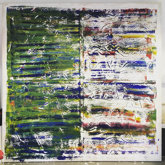 The green area. Green is known to be associated with self-esteem, rebirth, revitalisation. On the other hand, green can be associated with putrefaction and sickness. Linking all that connotation to grief, my thought behind was the clash between death and rebirth. It's like a monologue I watched called "The Birth of Death". At the end of the show the actress said "there's always birth after death" and that stuck with me. After something bad happens in your life - death, a break-up, sudden change - it's like a new you emerges. You're stronger - maybe not at the beginning - you're wiser, you're more aware, you're more alive. Maybe this is the plan all along. You know, the why we have to go through hardship. But anyway, that's the colour green. It moves along the canvas in a horizontal motion. From left to right. Kind of like a passage of time. Clockwise. When it reaches the middle of the canvas, it breaks into fragments. Shattered emotions breaking into the horizon. In that area you have a mixture of colours. There is red, blue, green, orange and yellow. - There are some shades of pink. Not intentionally, it's just how the paint met one another as I scrapped - just thought I'd be honest with you. The red. Blood (obviously) - there's not much to explain about it. You get it, right? The blue. So blue is associated with grief, directly. It's also commonly known to signify sadness. The orange. Optimism. The sense of "better things to come". A hope for better days. The yellow. Serenity. The state of being calm, untroubled. Now, that's a tricky feeling. One that is probably the most difficult to achieve. Behind the green area through the spaces, you can still see the layers behind. They are the same colours from the right hand side. Blue is scattered all throughout the canvas with the same meaning as mentioned before (also see the genealogical tree post). It is of course the main emotion. The main subject of the piece. It's only right that it'd be everywhere. The stripes As I mentioned in the priming post before, I left the priming quite thick to create stripes.
From the images you can see the effect it left. It's got texture and as the press the canvas with the paint onto it, the lines created border, breaking the colour, giving it an end and a continuation straight after. Additionally, they mean the cuts and scars of life. How we hurt but heal. Just give it time.
0 Comments
 After then deciding and getting the canvas made (which by the way I helped on the making of it), I had to start priming it. I looked at the most efficient but cheapest way of doing it. I knew I wanted to use gesso as I had seen it being used before and I liked how smooth it looked. But budget was a factor in the process, so I found a recipe. Few grams of calcium carbonate, water, white paint. Got to mixing. Had to do 5 layers. 2 of just priming and 3 of just white paint. I used a little spatula to apply it with. The motion of the spatula left some thick cut-like lines which as I'm applying colour now they give texture and enhance the meaning of the piece. I left the corners of the canvas unfinished. Sort of like the painting was a cloud in the middle of the canvas. Any rupture on the canvas, that cloud could escape and be free again.  I had been for a long time trying to think about how I can then showcase my idea on a final piece. I watched videos about Rothko, Joan Mitchell, Richter, Hilma Af Klint, Mondrian, Pollock, Krasner and many others. Watched videos about what is the world of abstract. Visited galleries and experienced seeing the works for myself. All I noticed was: the difference in impact between small and big works. In the abstract world size is absolutely crucial for how overwhelming or not you want your piece to be. So I decided on a canvas. It was always going to be a painting, of course, since my work is about colour scraping. Perhaps I could have gone into it digitally but I'm more of a touchy person. I have to have it in my hands. But anyway, the size. Larger pieces had the most impacts on me. I felt taken by it. Like I was this tiny little dot. I couldn't possible replicate the same size in the space that I'm working in as there's not space but I decided to make the canvas to the largest size that it could fit through the door. So that was 2.3m. I know. I almost feel like I should have a bigger reason as to why I chose the size. I know why it's squared though if it makes things better?! It's a square to resemble a box. Much as the saying "trapped in a box" or "come out of the box".
Just how a person going through the pain of loss would feel. So one day I had the idea of using a canvas board.
I have a good relationship with canvas boards. I like how flat they are. So anyway, I had one laying around in the studio at home. I don't actually know how I came up with the idea, I must just picked it up and thought "Maybe I can put paint on this and drag on paper to see what happens". In fact, that's exactly what happened. The first experiment was the Black and Yellow piece. I was astonished by the result on the canvas board afterwards. "It could be a piece of art on its own!" - I thought. Such was my excitement and joy about it that from then on I couldn't stop doing more and more. The more I done it, the more I loved it and during the process, I discovered some of my most favourite work. The Life Journeys piece (top row, middle column), came out on a day when I was feeling very troubled. It was like life had shattered into pieces and I couldn't do anything about it. All happened so sudden and I didn't know why or how. So feeling all that, I set off to paint. The paper version of Life Journeys is the bottom left hand side picture. This painting has so much meaning to me, it's definitely my most favourite. The bottom row middle column painting came out of the anger I was feeling. Anger for not knowing what was going on exactly but how it was changing life completely. For me I guess, I've been learning how to not try to have control over everything. It's difficult - if you're like me you'll understand - so anger is inevitable. The top right hand side is the canvas product of this but it kinda reminds me of Dubai which definitely wasn't the intention. Ha. The blue piece was intended to portrait my sadness but with the serenity of the white. Much when you lose something you love, you go through stages until you come out on the other side. I guess I was going through all the stages at once, in one night. ps.: I've just realised that the sequence of the paintings is different if you're looking through a mobile phone. So here we go: If you are looking from a mobile, Life Journeys is the top right hand side and the paper version is the one right underneath it. The Fiery Heritage (red) one is the bottom left hand side with the canvas product right on top ;) Screen print squeegee
Now, with the squeegee you can make so many different combinations. It's a much bigger surface area to drag the paint so you can lay as many different colour as you wish. It's also got the perfect flat shape. You can get it in many different sizes so you can work with it in various different dimensions. Anyway, a bit less technical now. How do I feel about them? I think they came out really well. I felt comfortable using this technique, it was like the painting would flow easier. I wanted to try using the squeegee rather than trying to portrait a feeling, if that makes sense. However, I still had to try and explore other techniques to make a decision as to what to use for my Final Major Project piece... 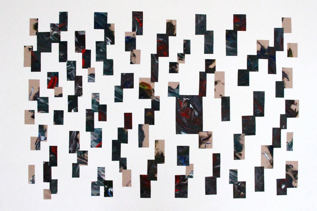 When I was still in the research process, I came across an old abstract painting I had painted at the beginning of the course. I had cut a few pieces of it but kept all in an envelope for a good 5/6 months, for no reason, just knew I had to keep it.
So after all those months, I found it again while going through my books and thought "why not get this pieces and stick them down on a A1? See what happens. As I was doing it, I started to notice how every piece - although all came from the same painting - had a different isolated mood. One piece was happy, another sad, the other dramatic. Wave-like colour splash. It was a discovery. Got me all pumped up to continue exploring. Scraping Technique
This is a highly effective technique in my view when it comes to mood/emotions. I've produced the best (in my opinion) bodies of work by scraping. As a person that hates waste, I hate when I finish a painting and there's still loads of paint left on the pallet. So what do I do? I scrape. It's like recycling at its best. Nothing gets wasted, not a single drop. I love these series of paintings. It's definitely up there on my favourites. 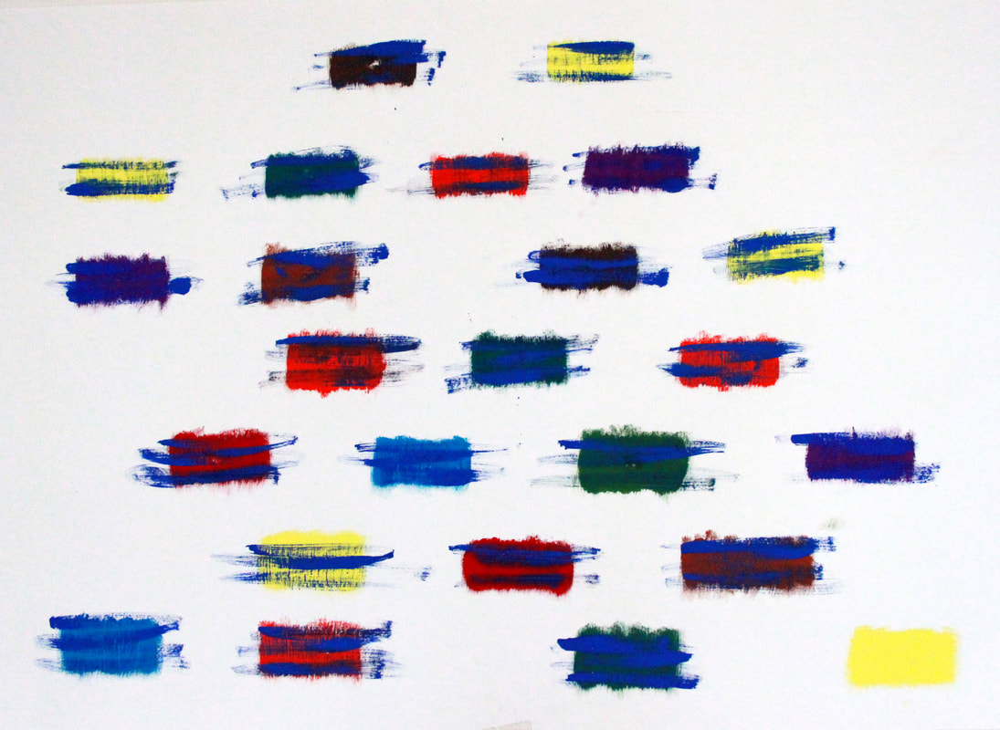 When I had this idea, all I had in mind was something I read about the modern social-geographical aspect of grief. It sounds like "what the hell is that?!". Well, I didn't know such thing existed either, but - and it made total sense after I read - there are these classifications of modern and post-modern grief and how now-a-days people more so than the early years, relocate to different geographical locations making the grief process totally change. You see, in a modern society when you grow to an age where you can survive for yourself you normally move out of your parents house, right? The usual time to do so is for university and it's very common for the child to choose to study elsewhere than its birth place.
With all that in mind -let's just hypothetically speak - that teenager's nan passes away. Now, that person is surrounded by uni peers, professors, and other people which don't know his nan. He now has to grief around people that think "oh it all happens for a reason" "she's in a much better place now" "she wouldn't want you to be upset" and all them cliche phrases we know of. Professors which are more worried about "he/she's been missing a lot of classes, he sure has a lot to catch up, will he/she be able to finish the year with a good grade?". And that's how this whole modern grief goes on. Same goes to somebody older that works away from home... blah blah blah. So with all of that in mind, I decided to sketch a genealogical tree. I thought about linking people up and making it more obvious but you know me, I like abstract so I left a bit to your own imagination. The different blocks of colour - different people; The blue lines - blue is associated with grief and more commonly with sadness so inevitably I'd use it. It means all the people and things that we have lost along the way; The last bottom-right-hand-side colour block without a blue stain - when I decided to paint that one, I had in mind that it would be the life of someone yet to feel loss. But who hasn't felt loss unless you're a just born child? But even so, you've already experienced losing the comfort of the womb and it's quite involuntary, it happens when it happens and I doubt that the baby knows when it's going to happen! I guess loss is just a synonym for being human. Ruler Works
Losing the protractor was sad. You're probably thinking "just bloody buy a new one!". However, I didn't want to buy a new one. I wanted THAT one and I couldn't deal with the fact that I had it one day and the next it was nowhere to be seen! (and to this date, I've never found it). Maybe you can say I struggle with loss, which is really funny since my project is all about that. Anyway, to be completely honest, I wouldn't have it any other way. I would have just got used to the protractor and made myself just paint with it and not explore using anything else. (Feel free to take this analogy to anything you do in life. Don't get used to anything. Explore more. Do things differently. You'll thank me for this) So I went onto the ruler after "failing" with the tile. I love using the ruler. It's easy to grasp and move along. It's also very flat which helps to move paint evenly. |
Authorsu moraes Archives
June 2023
Categories |


 RSS Feed