|
The next step was then to decide what colours to use. One thing I knew for sure: I wanted to work with acrylic. The reasons being are that most fine artists ignore acrylics (so I found) but not just that, as my project was about loss and grief, the dullness of the paint once dry really spoke to me. It was like life being sucked away. Also, let's be honest to ourselves, it's a super quick drying medium. Looking back at all the experiments and research I realised that there's really not a single thing that a person going through bereavement feels. It's something different everyday, varying throughout the same day. One day is anger, another hope. One day is happiness, another is a sense of hopelessness. And so on. I decided then to use multiple colours to portrait all these explosion of feelings one has. The emotions come like waves, taking over you, crashing against the rocks and sweeping you away. And that's what I went for. Each colour represents a different emotion. At different stages. And they break apart as the painting goes along in an attempt to insinuate fragments of time... Those pictures are in sequence of development. I found difficult to decide when enough was enough. When is it enough to show what I want to show? You always fear that you're going to end up putting too many layers and making it visually not as appealing. But why do I want it to be appealing? It has to be meaningful, thoughtful. Every line, every scratch, every mark. And that's when I'll know I've done enough. The final stage of the work encompasses all of that. Starting from the left hand side... 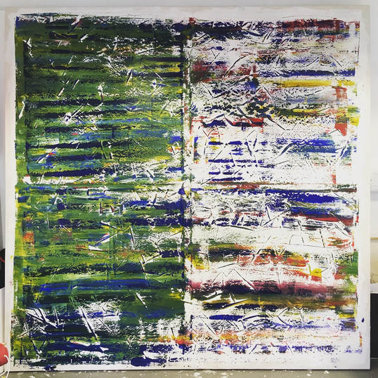 The green area. Green is known to be associated with self-esteem, rebirth, revitalisation. On the other hand, green can be associated with putrefaction and sickness. Linking all that connotation to grief, my thought behind was the clash between death and rebirth. It's like a monologue I watched called "The Birth of Death". At the end of the show the actress said "there's always birth after death" and that stuck with me. After something bad happens in your life - death, a break-up, sudden change - it's like a new you emerges. You're stronger - maybe not at the beginning - you're wiser, you're more aware, you're more alive. Maybe this is the plan all along. You know, the why we have to go through hardship. But anyway, that's the colour green. It moves along the canvas in a horizontal motion. From left to right. Kind of like a passage of time. Clockwise. When it reaches the middle of the canvas, it breaks into fragments. Shattered emotions breaking into the horizon. In that area you have a mixture of colours. There is red, blue, green, orange and yellow. - There are some shades of pink. Not intentionally, it's just how the paint met one another as I scrapped - just thought I'd be honest with you. The red. Blood (obviously) - there's not much to explain about it. You get it, right? The blue. So blue is associated with grief, directly. It's also commonly known to signify sadness. The orange. Optimism. The sense of "better things to come". A hope for better days. The yellow. Serenity. The state of being calm, untroubled. Now, that's a tricky feeling. One that is probably the most difficult to achieve. Behind the green area through the spaces, you can still see the layers behind. They are the same colours from the right hand side. Blue is scattered all throughout the canvas with the same meaning as mentioned before (also see the genealogical tree post). It is of course the main emotion. The main subject of the piece. It's only right that it'd be everywhere. The stripes As I mentioned in the priming post before, I left the priming quite thick to create stripes.
From the images you can see the effect it left. It's got texture and as the press the canvas with the paint onto it, the lines created border, breaking the colour, giving it an end and a continuation straight after. Additionally, they mean the cuts and scars of life. How we hurt but heal. Just give it time.
0 Comments
Leave a Reply. |
Authorsu moraes Archives
June 2023
Categories |
 RSS Feed